Le Mans Centenaire - Nielsen Racing 14 (Oreca 07)
About the illustration:
The idea behind the illustration was to evoke a sense of “evolution” and “changing times”. Not sure if I managed to capture that, but the main point of focus is the modern Oreca 07 racing car #14 by Nielsen Racing. As the eye goes further down the race track, you start seeing a shift in the asphalt that turns into a dirt road. This is how the viewer goes back in time.
The rightmost part, as well as the parts closest to the viewer, are set in the modern age, while the farthest part of the road and the leftmost part of the image, are set in a different time, where cars were much slower, circuits were much less safe (with expectators right next to it) and racing was done on dirt roads.
The 24 Hours of Le Mans this year was huge thanks to the 100 years celebration after a Chenard-Walcker won the first race in 1923 🏁
Inspiration for this artwork came from this history, the heritage and the will of smaller teams to make their name. I find this very inspiring ✨
And I'm not talking just about Le Mans. I see Nielsen Racing as one of those teams working harder and harder each year to get to a higher category and glory, but brands like Omologato too, who support the sport, and even get harassed by "big name brands". Who are shit scared of their success.
Of course, as an illustrator with less than 1k followers, I feel like one of those. Surrounded by artists with thousands and thousands of followers, I feel a bit tiny. But I don't take any like, retweet or comment for granted, and love all your support. I'm so thankful to all ✨
This can not be a lot of work, can it? Well… it can!
What does the process look like?
If you haven’t been following the process on Twitter, here’s a bit of a timeline for you:
Initial sketch
Sketch after clean up. The idea has already changed to the “Le Mans through time” one.
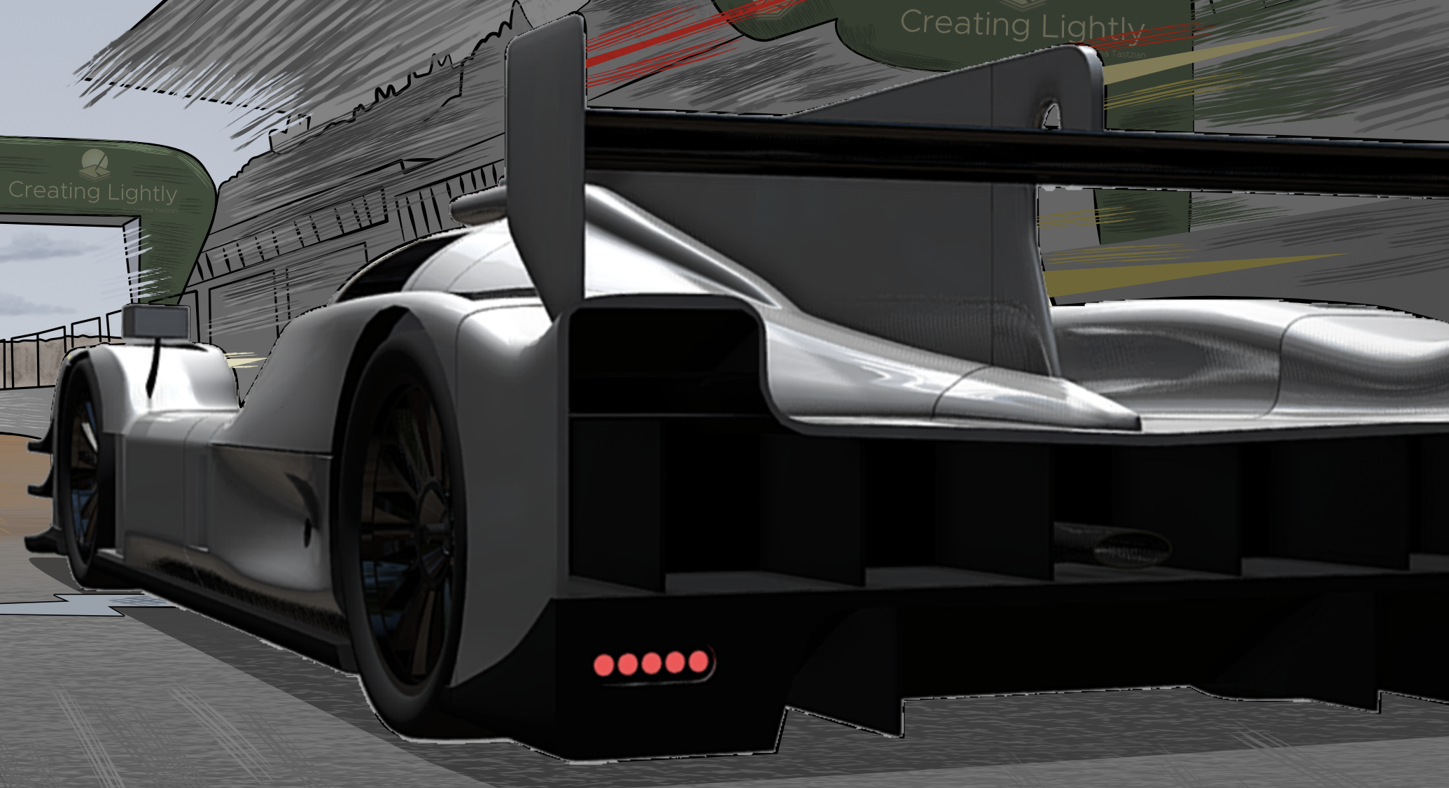
First blocking of colours. Here’s when I noticed the 3D model I used as reference was wrong.
Here’s such design fixed. Compare the rear vents as the biggest difference, but there are other minor ones.
Oreca 07 body finished and first sponsors done
Oreca 07 and complete livery finished
Inspiration and reference
Already mentioned the image from the 1923 race, but here are some more things I used as inspiration for this illustration
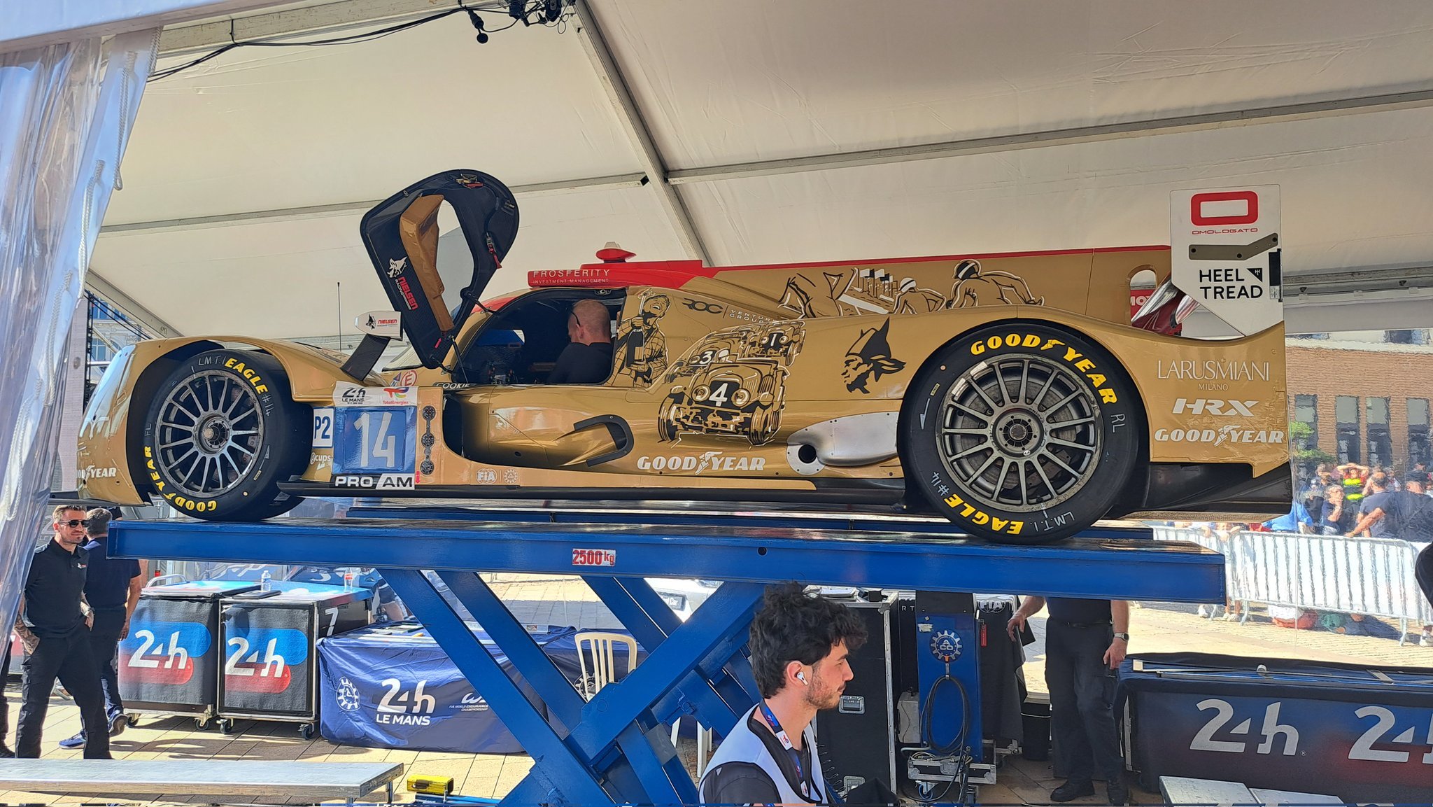
Team Nielsen Racing hard at work at Le Mans
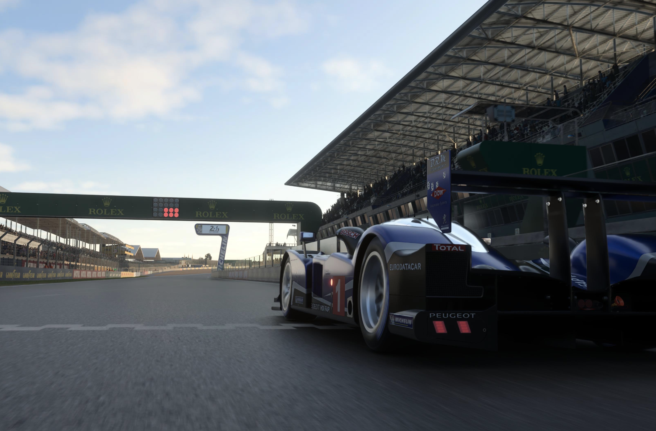
Gran Turismo 7 reference I created from my initial idea, using a Peugeot 908 HDi FAP - Team Peugeot Total '10
Oreca 07 3D model I found online and posed in the way it matched my desired composition.
I hope you enjoyed the artwork journey as much as I did creating it! If you did, don’t hesitate to share this on social media. Feel free to visit the Creating Lightly store or buy me a Ko-Fi on the bottom left button. Thanks for your support!


