
How do you create a new brand from scratch?
The journey towards the new Creating Lightly branding
Many of you are familiar with my public set of skills. Being a graphic designer is absolutely not one of them, as I found out the hard way.
We are all experienced and knowledgeable in some areas, and weaker in some others, but there’s always stuff we think we could do well, until we try it. As a software engineer and an artist with a very methodic mind, I set out to “follow some tutorials and create my new brand image”. I thought that with a couple of hours worth of videos and my current proficiency in Affinity Designer I could get my new brand look and logo out in no time. Branding and creating a coherent look, combining fonts, colours and logos is not easy.
On October 12th, around two weeks had passed since I started creating the new look. I consider ir finished, but not without having a lot of newfound respect for professional graphic designers, since what they make seem effortless is in fact a result of hours upon hours of applied experience, brainstorming, understanding and mostly refining. But enough intro for today’s post. Let’s get right into it!
Where do you come from and where are you going?
Many of you may remember the original Creating Lightly logo. If you don’t here’s a refresher:

Original logo
And here is the new Creating Lightly logo:

New logo
Pretty neat, huh? But it was not easy.
The original logo, I won’t lie to you, was done in around an hour from idea inception to the exported files. That’s nothing comparing to the approximately two weeks that passed from when I started juggling ideas for the whole brand (colours, logo, font, general look) to the finished one.
The thought process of the original was something like:
“Make something that looks ok in a round space for profile pictures. To relate it to ‘Creating Lightly’, let’s use a stylized C with a stylized L. That looks kinda like a slim moon. The L could be some kind of abstract bird. Yeah, looks ok. Add some gradients and you’re done.”
The process for the new one, on the other hand, was somewhat like:
I need a recognizable brand (that’s already much more).
I need a colour scheme. One main colour and at least one accent colour. This will let me use the scheme throughout the website for coherence.
I need a logo. I want it to be related to what I do and at the same time, I need it to be readable.
Both colour scheme and logo itself need contrast to work the way I need (easy on the eyes and readability both big and small). And not just contrast in terms of colour or values, but also in terms of shapes.
Regarding the colours, I know certain colours for brands make people feel different things (colour psychology). I wanted something serious but inviting. Not overly playful or childish. I wanted it to look cool, stylish, and easy in the eyes.
I need a new way of writing the name, so it looks good and it’s also recognizable (new font).
And many more things I will walk you through later.
That’s one amount of requirements compared to the first one, isn’t it? Specially for someone like me with zero experience in anything graphic design related.
Let's talk about colours
I investigated a lot about colour meanings and what they make people feel. I wanted something serious and trustworthy, but not oriented to an older audience. Something in between, but also not too young.
I feel the idea behind Creating Lightly is to be able to connect with my clients in a professional way first, and in a more friendly way later. I want to be trusted but also approachable. I want you to think I can help you get the artwork you dream of, but also talk to each other like we are long time friends during the process and afterwards.
Browsing some websites with colour recommendations according to your needs, I found that the most obvious choice for my needs was some shade of blue. So, going after that and an accent colour to make contrast (rule of thumb: the opposite in the colour wheel), I started the search.
Shades of blue as a main colour, some kind of coral/salmon as accent.

Shades of coral/salmon as main colour, shades of blue as accent.
Also the same tests with shades of grey to test for a more neutral look.
Enter the first new logo
With the first approach gravitating towards a shade of blue (mostly a trust inducing colour), I checked my above colour combinations. I settled in a shade of dark-ish blue for the main colour, and then doing all the illustration/accents in a much lighter shade of blue. Honestly, I didn’t feel that any of the high contrast colours made much sense, and they even were somewhat eye-pain inducing. Here’s some inspiration I found regarding colour combinations and style.

It looks great, but as much as I like the blue/orange colour combination, it’s used way too much, everywhere. It’s like the low hanging fruit of colour combinations. Looks good, it’s easy in the eyes, and that’s why it’s everywhere
Creating Lightly is a brand that should embrace my artistic expression. As such, since my main art output is illustration, and specifically digital illustration, I went to one of my main tools: the Apple Pencil. Here’s the first “serious” idea.

Inspired by the Apple Pencil I was holding in my hand, I illustrated a perfectly symmetric pencil with a round background and different shades of blue as main and accent colours. It looked good, but it looked an awful lot like many of the apps out there like Telegram or even Twitter (and mine isn’t even an app!). I needed something else. Something more… me.
Enter the grey and yellow-y
I’ve always had something for the “black and gold” combination that got in my radar thanks to the legendary John Player Special racing livery.

Source: Petrolicious
It looks serious, premium, interesting. But I didn’t want to use the exact same, because it also looks “John Player Special racing” and I didn’t want to be associated to that. I wanted to have something that reminded people of me, more than something else, as well.
Sharing these thoughts with my wife, she suggested the “grey and yellow-y” combination. I have a hard time calling it just “yellow” since in my head, “default yellow” is more saturated and vibrant. This one is more pastel, I think. I tested it out, tweaked it a bit, and honestly loved it.
I think it has all the properties I looked for and also the properties I liked about the “John Player Special racing” combination. Once I saw it in action, I instantly knew it was the one to go with.
Let the fonts tournament begin!
Font choice was up next. I wanted something that went well with the new colour scheme, so it had to be nice, clean, sleek, serious, beautiful. How do you do that? With a fonts tournament, of course!

I really don’t know if it was the best way to go forward with this, but what I did was list every font I liked in my system, and wrote the brand name on top of each other in that font.
After that, I checked in pairs, and picked one. Many choices later, I ended up with a font with a name I can't remember, but wasn’t free to use, so I googled for a free alternative. Luckily I found the final choice, which I liked even more than the tournament winner, and here we are. I love it!
Pencils, pencils, pencils
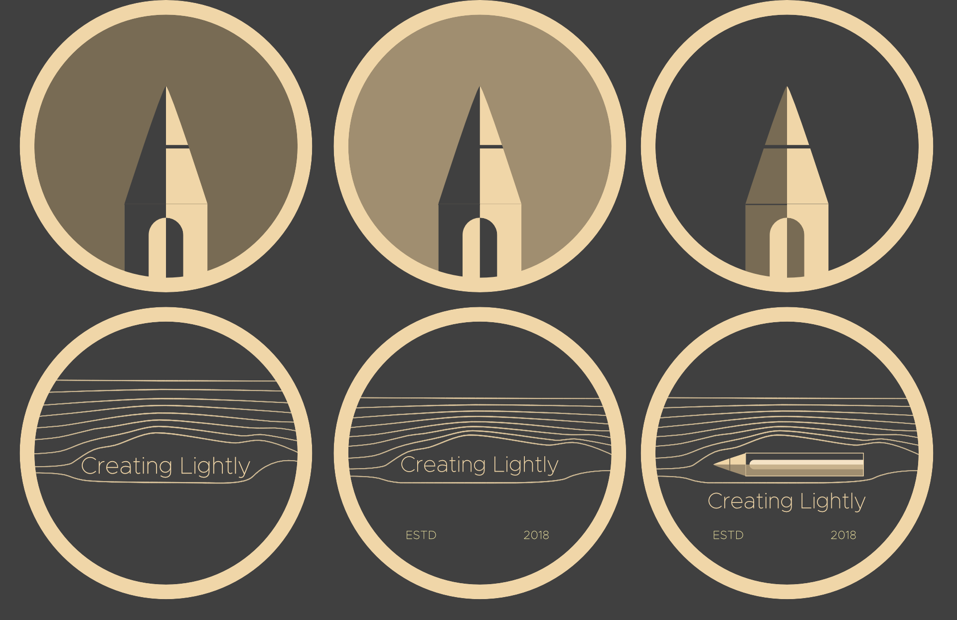
If you remember from earlier, the “first new logo” was a pencil in a blue colour scheme. That wouldn’t cut it with the current colour choice, so it was time to move from blue to grey and yellow.
I also wanted the logo to be recognizable both big and small (as a profile picture), so my first idea was to add the brand name within as well, so there are no mistakes. These are the first drafts:

As many ask about the “ESTD 2018” part, ESTD means “Established”. It’s when the brand was first launched. Spoiler alert: it didn’t make the cut.
None of these options was chosen, of course. The main problem was the fact that when seen from far away (or very small), the text was, of course, unreadable. I didn’t want people to have to guess what the unreadable text said in order to understand the logo completely. It was frustrating.
The next step was to try and make the logo recognizable by itself (which would end up being the final idea, but with a different logo).
Here some more ideas were juggled. Some more pencils, and even some “aerodynamics style” logo, with the name and the pencil itself.
There’s no harm in exploring, but I didn’t find much in these ideas. I hit a dead end. I was with some kind of “burn out” of ideas. So I stoped for a while to freshen my mind up.
High contrast drawing as a logo
My next idea was creating a logo from a drawing that represented what Creating Lightly does. The ability to create in a “no pressure” way or environment. So what better way to represent that than overlooking a nice relaxing waterfall and mountains? Add to that a C shaped moon and an L shaped waterfall + river for maximum “CL” reference, and you’ve got yourself a logo!
Well it sounded good, the references were good (asked for reference to friends in Twitter, and also got into a game to shoot reference by myself), looked good as a landscape logo and a circle profile picture and all, but I wasn’t really sold.

Creating lightly leaning on the back of a convertible. It sums it up, doesn’t it? Bonus points if you guess the car.
As you can see here, perspective grids and rule of thirds were usually in place. I even played with golden ratio grids as I went further with the logo ideas to space everything in a more harmonious way. More on this later.
This drawing was just a sketch. It didn’t get to a more polished phase because I wasn’t feeling it too much, and luckily, the final ideas appeared.
Working with layers
I do my art digitally. That includes software with digital layers. And the layers icon is very recognizable and at the same time, very important in my type of workflow, so it suited the idea perfectly.
First I thought again about the concept of being chill while creating, no pressure. What better than a mate or a cup of coffee?


The mate logo sketch didn’t get anywhere but looked nice. Then there’s the coffee logo sketch and polished coffee logo. While looking good, there was one final idea to try out. I decided to revisit inspiration with the original pencil logo. Tried to use a pencil instead of the coffee cup, since it relates more with what I do.

And after applying some color and shading techniques I usually do on my illustrations, I finally found the look I wanted.

Final words
So this is it! The final result. It was certainly a long journey from the desire of making a full brand makeover, until the end result, and specially difficult since as you know, I am a software engineer and that’s quite far from graphic design, both in skillset and in way of thinking.
These difficulties make me even more proud of having been able to pull it off and with such good results (at least to my eyes!).
I hope you enjoyed this story as much as I did going through it and writing this post. Please, let me know in the comments below or via Twitter (and even the contact form if you prefer) if you found it interesting and would like some more, or if you have any other topics you’d like me to write about.
I will probably be writing about how I created the website using Squarespace. The good, the bad and the surprises I came across while developing it. It’s going to be informative and fun as well. I hope to see you there!